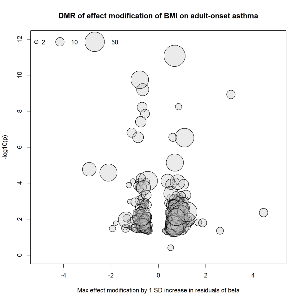
This is a bubble plot using general plotting functions in R. While x- and y-coordinates represent effect size and p-value as in volcano plot, circle size represents another information (in this case the number of CpG sites in each region). See the original publication for details.
### Not to run ###

# read in DMR results
dmr.bmi <- readRDS('results/dmr_ewis_adultast_bmi_nonatopic_wo_neu.rds')
dmr.bmi <- as.data.frame(dmr.bmi)

# bubble plot
jpeg(file = 'documents/manuscripts/IJE_submission/figure3.jpg',
     width = 1600, height = 1600, res = 200)
with(dmr.bmi,
     plot(maxbetafc, -log10(minfdr), pch = 21, cex = no.cpgs^.5,
          col = 'black', bg = adjustcolor('grey', alpha = 0.3),
          xlim = c(-5, 5), ylim = c(0, 12), ylab = '-log10(p)',
          xlab = 'Max effect modification by 1 SD increase in residuals of beta',
          main = 'DMR of effect modification of BMI on adult-onset asthma'))
legend('topleft', pch = 21, pt.cex = c(2, 10, 50)^.5,
       legend = c('2', '10', '50'),
       col = 'black', pt.bg = adjustcolor('grey', alpha = 0.3), bty = 'n',
       horiz = T, x.intersp = c(1,2,3), y.intersp = 2)
dev.off()
